border-image CSS property and SVG
In a nutshell, border-image is a CSS property that allows box decoration “on top” of (or “overwriting” if you like) border. MDN has extensive documentation for these (rather underused) properties and values, but I will use SVG instead of bitmaps or gradients, and note some interesting cases.
It was 7 years ago that I wrote about border-image for the first time (there is an -almost complete- snapshot of that article at the Internet Archive, in Greek), to style a button without background-image or the sliding doors technique. At that time, the support for border-image properties was not good, while Microsoft Internet Explorer(s) had a rather large install base and did not support border-image at all. It was too much hassle, it needed JavaScript to render across the board, and the fallback was ugly at best. However, nowadays most browsers support border-image and we also have the @supports feature query, in case you need to support legacy user agents.
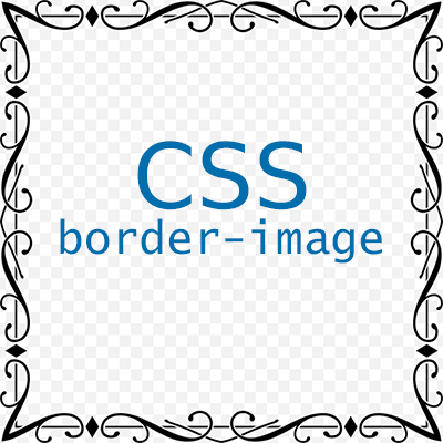
Let’s start with a cropped and resized image, hastily traced to SVG and futher optimized to save some bytes. According to the spec, the border-image property is a shorthand for border-image-source, border-image-slice, border-image-width, border-image-outset and border-image-repeat properties, in this order. Only border-image-source is required, but the default value of border-image-slice is 100% (of the image) so the final “effect” will probably be not what you expect. You see, the provided image is “sliced” in nine regions — four corners, four edges and the center which I will ignore for the time being. The corners are handled in a different way than the edges, which essentialy is what border-image is all about! I find the illustration of the slicing at MDN kind of misleading, with the “left” label positioned above the first corner region and the “bottom” placed on the fourth corner region, so keep in mind that the order of the border-image-slice possible values are top, right, bottom, left, as is the case of margins, paddings, borders and other CSS properties.
The SVG for the border-image-source was generated from the PNG and then resized to an arbitary 180 pixels width and height, for no other reason that to be smaller than the example boxes. So, let me draw a bunch of mostly empty <span>s at 440 (max-width) by 200 pixels and use the border-image-css-and-svg.svg:
border-style: solid;
border-width: 50px;
border-image: url("border-image-css-and-svg.svg");
Box content
The spec states that the border-style and border-width must have values for the border-image-source to actually render. If no values are supplied for the border-image-slice property, the image will be rendered at the corners, according to the value of border-width — not really useful, or nice! Anyway, most of the time you will not leave the border-image with the defaults, so let’s move on.
border-style: solid;
border-width: 50px;
border-image-source: url("border-image-css-and-svg.svg");
border-image-slice: 50;
Box content
Looking good already! I used a “magic” number of 50 pixels for border-width and border-image-slice properties. That way, the border is thicker than it should be. For this particular image at those dimensions, a 37 should look better· the slicing would be on the bullets near the corners. Keep in mind that this SVG was traced from a PNG and may not very clean:
border-style: solid;
border-width: 37px;
border-image-source: url("border-image-css-and-svg.svg");
border-image-slice: 37;
Box content
It looks almost the same, but the content inside is larger. Half of the bullets at the corners are streched horizontally (and vertically too, but it does not show at this height) since those bullets are cut in half by the slicing. But let’s see the PNG now (border-image-css-and-svg.png):
border-style: solid;
border-width: 37px;
border-image-source: url("border-image-css-and-svg.png");
border-image-slice: 37;
Box content
Not bad really, but SVG streches better along the top and bottom edges, as expected. Let’s stick to the SVG and explore a couple of other properties, namely border-image-width:
border-style: solid;
border-width: 37px;
border-image-source: url("border-image-css-and-svg.svg");
border-image-slice: 37;
border-image-width: 1.5;
Box content
border-image-width is a difficult property to understand, since the outcome depends on the unit of the value(s). A unitless value will scale the image in relation to the border-width while a percentage value will scale in relation to the width or height of the respective region. Let’s see a percentage:
border-style: solid;
border-width: 37px;
border-image-source: url("border-image-css-and-svg.svg");
border-image-slice: 37;
border-image-width: 150%;
Box content
Well, this looks interesting, but the edges are missing from the rendering! Also notice that the border-image is rendered below the background of the content. How about reducing border-width and border-image-slice values:
border-style: solid;
border-width: 24px;
border-image-source: url("border-image-css-and-svg.svg");
border-image-slice: 24;
border-image-width: 150%;
Box content
OK, this is getting out of hand! I have removed the pattern from the background of the content to better admire the result, which is… unpredictable, and maybe that is the reason that border-image does not get enought love, so let’s stick to logical” values from now on! How about playing with border-image-outset:
border-style: solid;
border-width: 37px;
border-image-source: url("border-image-css-and-svg.svg");
border-image-slice: 37;
border-image-outset: 18px;
Box content
border-image-outset accepts a positive number as the distance of the outer edge of the border-image to the outer edge of border itself. The box dimensions do not change, and the border-image does not trigger overflow — like box-shadow. That is why it will happily bleed onto anything around the box. And what about the border-image-repeat?
border-style: solid;
border-width: 37px;
border-image-source: url("border-image-css-and-svg.svg");
border-image-slice: 37;
border-image-repeat: round stretch;
Box content
Finally, the border-image-repeat does the magic that is quite difficult to achieve otherwise. Unfortunately, it accepts only one or two values. If one of stretch, repeat, round, space (the default value is stretch) is provided, it is applied on all edges, otherwise, the first keyword applies on the top and bottom edges, and the second applies on the right and left. In the above example, the browser uses the top and bottom regions, repeatedly and stretched if needed, to achieve a “seamless” border, while the right and left edges stretch to fill the available height.
It is true that a similar result can be achieved with a background-image with background-size: 100% 100%, but the repeat-and-stretched edges are hard to do. OK, it can be done with multiple background-images but it won’t be seamless and fluid at the same time! Granted, border-image is not something that is needed very often but it is certainly a useful addition to your CSS toolbox!